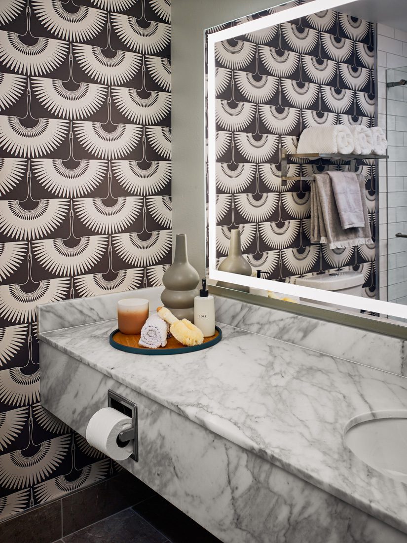
Libby Patrick, founding principal and CEO of Buckhead interior design firm Sims Patrick Studio, shares her wallpaper best practices!


DO:
Use fun and bold patterns to emphasize the story you are trying to tell in your space. This can be done using specific motifs such as trees, insects, reptiles, birds, plants, flowers—all depending on who will be using the space and the type of mood and narrative the room is trying to convey. You can even bring in the flora and fauna from a specific locale that is meaningful to you. Once identified, these themes can also be used to design custom wallpaper patterns.
Be inspired. Use your imagination and interests to narrow down your inspiration points, and then your wallpaper can be a key point of that final vision. For example, if you are inspired by an era in history, say the 1920s or 1960s, a particular pattern from that time can be easily pulled into the wallpaper, and the space can evolve from there.
Think outside of the box. Put decorative wall coverings in spaces you might not expect. This could be the inside of a closet, behind the mirror in a powder room, or in a more relaxing space. For example, use an ombre gradient in a spa or a metallic ceiling covering in a communal area.
DON’T
Go in without a strategy. Wallpaper is most effective when used as a statement piece in a room or to advance a design narrative. Basically, don’t just use it to use it. Make sure it is a key part of the story you are trying to tell, otherwise you can use strategically placed artwork or other thoughtfully placed design elements instead.
Blow your budget. When used effectively, a dramatic wallcovering can make all the difference in a room. But be mindful of your budget, and make sure you are using it for necessities and accents where they really count. Allocate your funds for statements where they are most needed and use other impactful pieces to pull the space together when wallpaper isn’t an option.
Mix influences. Once you have decided on a central narrative, make sure that you are keeping the space cohesive. For example, in our project at the Terrace Hotel [in Lakeland, Florida], the design was 1920s inspired, and we pulled this into all aspects of the property. The wallpaper was a key part of rounding this out with thoughtfully designed, ornate Art Deco patterns. Too many mixed influences can make any space feel chaotic, be stressful to the user and will muddle your overall vision.
SIMS PATRICK STUDIO
404.261.6043
simspatrickstudio.com
@simspatrickstudio
Giannina S. Bedford is multi-faceted writer and editor. Her work covers design, travel, food and business. She’s penned Simply Buckhead’s home feature since inception and held a variety of editorial roles at the magazine. Her freelance work has appeared in Condé Nast Traveler, USA Today, Virtuoso Life, Hemispheres and TravelandLeisure.com. She also contributes regularly Atlanta Business Chronicle. Fluent in Spanish, Giannina was born in Miami and grew up in Brazil, Chile, Hawaii and Australia. She currently lives in Dunwoody with her two kids and husband.


