How one couple converted a traditional European home into a modern marvel
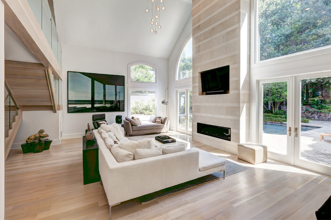
When Suzanne and Dale Kirkland first met four years ago, he was living in Atlanta and she was living in Chicago, but she also had a condo in Buckhead. When it became apparent they would stay together, the couple decided it was time to find a house where they could create a home. They found that house in Buckhead near Chastain Park. “We liked all the natural light [streaming in the windows],” says Suzanne, an insurance broker. “That’s what drew us to the house.” She adds they also liked the location because it’s an easy commute to work for Dale, a banking and finance executive.
Originally built in 1990, the 5,500-squarefoot home underwent renovations by previous owners, but the couple was ready to make changes of their own. So in 2015 they enlisted the services of Moon Bros. architects and Chuck Whiteside of Miracle Construction to perform yet another round of updates.
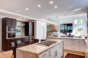
One of the first steps was opening the floor plan on the main level, which called for removing the existing wall between the kitchen and the family room. In the kitchen, they took out the beamed ceiling, exchanged the expansive island with a smaller version and replaced the cabinets with custom cabinetry made of eucalyptus. And they traded the previous oven, cooktop, dishwasher and refrigerator for sleek Miele appliances that blend seamlessly into the decor.
In the family room, they replaced the stacked stone fireplace with limestone, while in the living room, the traditional fireplace with a wood mantel was changed out for a more modern, marble rendition. In both of those rooms, the Kirklands also removed the grilles from the arched windows to provide more panoramic views of the front and back yards, and they worked with Lighting Loft in Buckhead to create custom light fixtures for the family and dining rooms.
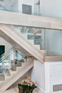
Between the first and second floors, the grand staircase originally featured carpet and a spindled railing; the updated version has hardwoods and glass handrails, another element that draws the light. “Our preference was to maximize the natural sunlight,” says Suzanne. “Any time we could open a walkway or a hallway or raise the ceiling, we did.”
With the work now complete, Suzanne says she couldn’t be happier with the outcome. “We love the openness and the high ceilings in the main family room. It has a minimalistic, contemporary feel. We love the simple, clean lines. We’re not at all traditional.”
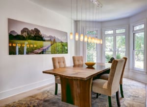
The couple chose a neutral palette as the backdrop to the interior design, preferring to let their furnishings and artwork provide color and texture. “We wanted the art to pop, and we had unique furnishings like the purple sofa [in the upstairs den] to [lend that] pop,” says Suzanne. “We wanted it to be versatile.”
Their art collection is from around the world, which accounts for its variety. The mix is also a reflection of the couple’s individual tastes: He likes pop art, while she favors realistic. “We travel a lot,” notes Suzanne, “which is why we like art and unique pieces.”
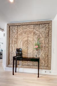
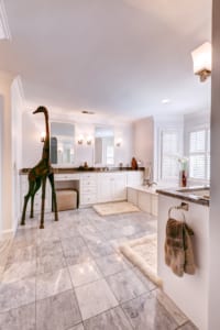
The couple purchased the picture of the water scene in Cuba that’s in the family room while traveling in Austria. An expansive wood carving in the foyer was imported from Myanmar, and the nursery features a painting of Vietnamese ballerinas that Suzanne picked up about 15 years ago while visiting that country. Suzanne’s friend, artist Deborah Argyropoulos of Austin, Texas, did the horse painting in their 2-year-old daughter’s playroom. There’s also a whimsical giraffe holding court in the guest room bathroom on the second floor. They did purchase some art locally, including a Marilyn Monroe painting by John Stango that came from Vinings Gallery.
Many of the furnishings reflect a worldly aesthetic, as well. “We love Asia and the Asian look,” says Suzanne. For instance, the entryway table and the side table by the couch were purchased from The Golden Triangle in Chicago, which imports pieces from all over Asia.
Many furnishings were handmade, such as the TV cabinet in the upstairs den and the beds in the bedrooms. Suzanne worked with her designer, Todd Heiser in Chicago, to outfit and decorate the home. In many instances, he repurposed pieces Suzanne had in her Illinois home, such as the chaise in the family room. Originally in a blue velvet that matched nothing else, Heiser recovered the piece in mohair. “Todd helped me with the vision,” says Suzanne. “He’s very modern.”
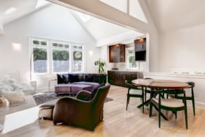
Looking at it now, Suzanne says her favorite aspects of the home include the openness of the living space, the warmth of the hardwoods and the fieldstone of the family room fireplace. “I think it all blends,” she says. “So many other homes we looked at were more traditional. This is much more international.”
3 RENOVATION PREP TIPS
The Kirklands’ home had undergone several previous additions and modifications that introduced some unforeseen design changes during construction. For example, the home previously had a second story added, and upon demolition, a steel I-beam crossing the entire kitchen ceiling was uncovered that required modifications to the new framing design and wiring plans. Here, the Kirklands’ contractor, Chuck Whiteside of Miracle Construction, offers three suggestions for avoiding similar issues during your own renovation project.
1. Thorough planning means a better end product. Spend extra time in the planning stages to get all the details flushed out. The result will be fewer surprises and lost time during construction.
2. Design to the budget. Too often homeowners pay for an elaborate plan they’re excited about, only to be sticker-shocked when they get the final construction estimates. The project scope should be defined by your budget, and your team of architects, designers and contractors should be selected based on who will serve as your “budget advocates” from start to finish.
3. Roll with it. Always go into a project with the understanding that there will be unexpected changes, especially with older homes that have been tinkered with in the past. Try to enjoy the process and be prepared to make adjustments while keeping the final goal in mind. Make it fun, not an ordeal.
STORY: Karon Warren
PHOTOS: Markham White
Simply Buckhead is an upscale lifestyle magazine focused on the best and brightest individuals, businesses and events in Buckhead, Brookhaven, Sandy Springs, Dunwoody and Chamblee. With a commitment to journalistic excellence, the magazine serves as the authority on who to know, what to do and where to go in the community, and its surroundings.


