A 1980s CONDO IS SKILLFULLY RENEWED!
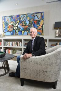
Kevin Todd enjoyed downtown urban living while working at CNN Center, but after retiring from his career as a finance executive, it was time for a change. In July 2018, he purchased a unit in Park Place, trading The Residences at W Atlanta Downtown for an address in one of Buckhead’s tallest buildings. The 24th-floor unit had a stunning view, but the interior needed attention.
“I wanted to do a renovation. This turned out to be a great fit for the amount of space I got and the ability to reconfigure it to what I wanted,” Todd says. “There are beautiful views of the downtown skyline looking south and the canopy of trees over the neighborhoods looking southwest.”
The 2,400-square-foot condo, clad in leopard print wallpaper, blush walls, tiled countertops and bi-fold accordion doors, had a compartmentalized floor plan and outdated galley kitchen. Originally built as a two-bedroom, the previous owner converted it to a one-bedroom with a large dressing space off the master. Todd wanted to bring back the second bedroom and update the living space with an open floor plan. For the massive undertaking, Todd enlisted Mark Williams and Niki Papadopoulos of Mark Williams Design Associates.
 “This building opened in the 1980s, so it was designed in the late ’70s. The way people lived back then was very compartmentalized, and there was a room for each individual function,” Williams says. “While this looks like a modern condo building from the outside, the original plans were based on that lifestyle.”
During approximately 18 months, the design team worked with Russell Carnes of Earth Sky Builders to recreate the interior. The entry corridor and kitchen were relocated, creating a sight line from the front door to a window-framing view of the downtown skyline.
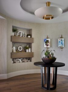
The new circular foyer, anchored by a custom Hellman-Chang table, makes a distant memory of the former trapezoid–shaped entry that once featured multiple doors leading to closets and sectioned-off rooms. The new, relaxed elegance is accentuated with colorful art works by Atlanta artist Sheyda Mehrara and built-in shelves that display a smattering of white accessories (Todd’s idea inspired by a magazine photo).
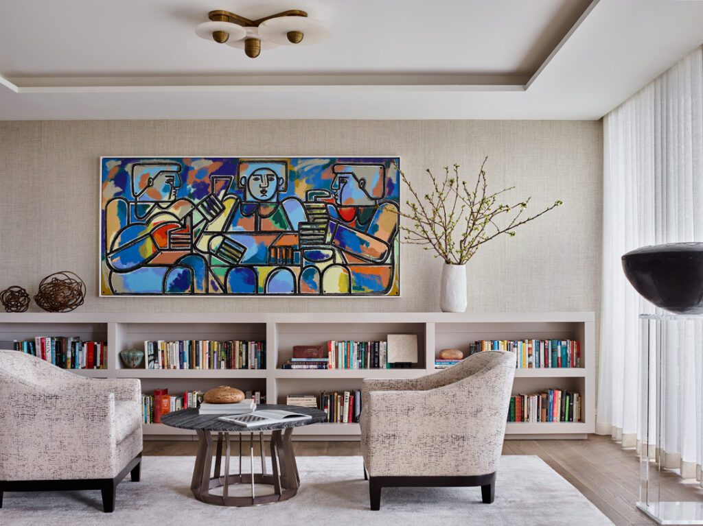
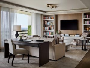
The home’s main corridor showcases black-and-white landscape photographs by British photographer Michael Kenna from Jackson Fine Art. Todd, an avid traveler, handpicked the images that capture locales from Japan to Italy. Across from the gallery wall, white oak panels open to hidden storage rooms, including a laundry space and Todd’s “shed” for tools and other garage-worthy items. The corridor is punctuated by the dining space where an oval cutout in the ceiling mirrors the shape of the table below it. From the ceiling hangs a light fixture of mouth-blown frosted glass spheres by Apparatus Studio that Todd handpicked from the brand’s New York location. During his shopping trip, he was also drawn to two alabaster and brass light fixtures that illuminate the main living space, including a conversation area furnished in a cocktail table and desk from Hellman-Chang and chairs from A. Rudin.
“Lighting open floor plans can be difficult. We wanted to avoid looking like a lighting showroom,” says Papadopoulos. “Apparatus’ Meridian series allowed us to do that in the main living space by utilizing different sizes and versions of the fixture.”
Lining the nearby wall is a waist high built-in filled with books, a smaller version of the floor-toceiling unit on the opposite side of the living room. Book storage was one of Todd’s must-haves.
“In his previous home, Kevin had done a lot of built-ins for books,” Williams says. “That was a front-end core requirement that we accommodate the books. And [we had to figure out] how do we do that beautifully and make it feel natural for the space.”
The collection of books is noticeable, but the most striking element of the room is the oversized painting by America Martin, commissioned through TEW Galleries, that pops with color against the neutral backdrop.
“When I introduced America’s work to Kevin, I was a bit unsure, but he really gravitated to her work more than I anticipated,” Papadopoulos says. “It was really a wonderful experience to work with her on this special commission.”
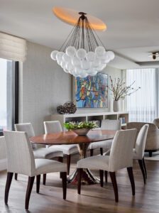
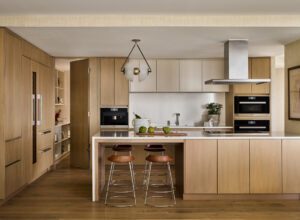
The open kitchen, equipped with Miele and Sub-Zero appliances, maintains the condo’s earthy hues with white oak cabinetry and quartz countertops. It features a four-seat island that’s the perfect vantage point from which to take in the skyline view through sliding glass doors that run the length of the living space.
“The space has a very relaxed, cohesive feel due to the colors, materials and fabrics used,” Todd says.
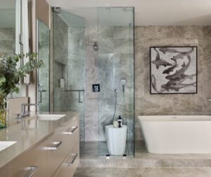
For some added texture, the design team installed a grasscloth wallcovering by Phillip Jeffries that extends throughout the main living space into the bedroom corridor. In the master suite, city views from a second balcony and two paintings from Anne Irwin Fine Art offer additional visual interest. An oversized glass door also provides an unexpected peek into the sleek master bathroom, done in quartz countertops and porcelain tile.
“When the door of the bedroom is closed, this entire suite belongs to Kevin, so it doesn’t matter [that the wall is glass], but it lets all the light through and makes the space feel larger,” Williams says.
Taking this condo from the 1980s into the design ideals of today was no easy feat, and Todd wanted to make sure the finished product was modern and upscale but still casual and inviting. Williams and Papadopoulos put their design acumen to work to make sure it was just that, creating an unfussy, yet sophisticated backdrop to which the homeowner could add his hand-selected touches.
“An important thing for Kevin was that it felt relaxed. We love that the current definition of luxury is about being calm and not that fake fancy from the late ’90s and [early] 2000s. Kevin’s vision was definitely not that,” Williams says. “Opening the front door and feeling that exhale of the comfort and ease of a space were important to him.

Mark Williams’ Top Tips For Design That Is Upscale And Relaxed
1. Keep your base palette of architectural materials simple and calm. Once you add “the stuff of your life” in front of the base architecture, you don’t want visual clutter.
2. Defining spaces with ceiling details or dramatic changes of color instead of building walls can help open plan spaces feel more organized and deliberate.
3. Texture on the walls, whether it’s a plaster finish or a natural fiber wall covering, is a fantastic way to “relax” a space. It’s amazing how the softness of a simple texture can create visual peacefulness.
4. Know where your focal points are and let them shine. As the story of a space unfolds, it should have a few starring players, and the rest should be supporting cast. If everything in the room tries to be the star of the show, the important focal points tend to disappear.
PHOTOS: Emily Followill
Giannina S. Bedford is multi-faceted writer and editor. Her work covers design, travel, food and business. She’s penned Simply Buckhead’s home feature since inception and held a variety of editorial roles at the magazine. Her freelance work has appeared in Condé Nast Traveler, USA Today, Virtuoso Life, Hemispheres and TravelandLeisure.com. She also contributes regularly Atlanta Business Chronicle. Fluent in Spanish, Giannina was born in Miami and grew up in Brazil, Chile, Hawaii and Australia. She currently lives in Dunwoody with her two kids and husband.


