Texas transplants make a Brookhaven new build home sweet home.
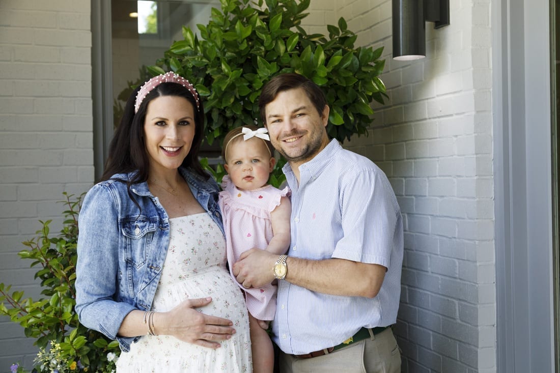
When William and Natalie Brooks moved away from their college town of Austin, Texas, they weren’t just changing geographic locations; they were changing lifestyles. In 2018, they traded a downtown condo for a new six-bedroom home in Brookhaven and began their lives as a married couple. Soon they were awaiting the arrival of their first baby, Bridgette, born in December 2019.
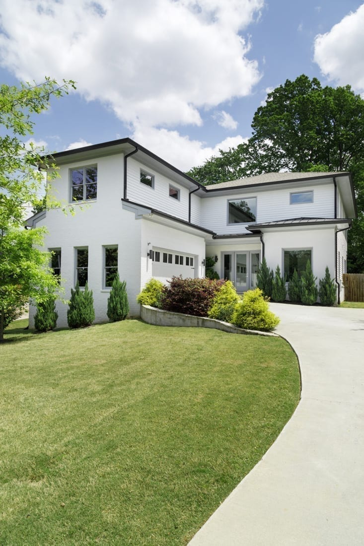
To fill the 4,686-square-foot home, Natalie purchased furniture and accessories in line with her love of a modern-meets-glamorous aesthetic. But the two-story home’s interior still needed some work.
“I thought I had bought enough new furniture to fill the house, but when we finished unpacking, it still felt as if we had just moved in and needed several more items to help tie everything together,” says Natalie, who relocated to Atlanta for her job as managing director at IT staffing and recruiting company Insight Global.
Natalie searched for a designer on Instagram and was drawn to the colorful work of Gina Sims Designs. The only drawback was that the firm had a waiting list of several months. Natalie and William decided to save some time by utilizing the firm’s eDesign services over traditional, full-service design.
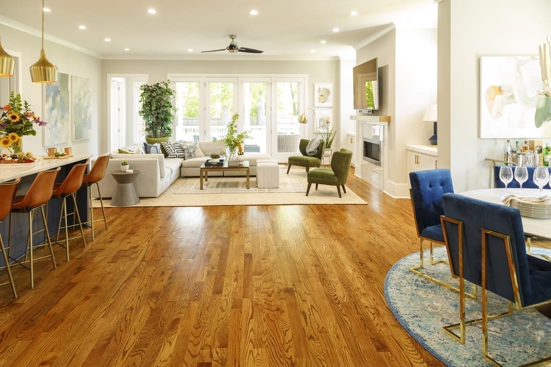
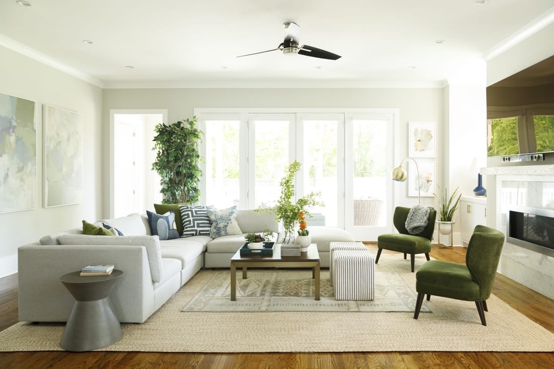
“I told them eDesign would be faster,” Sims says. “We email the floorplan, images of the items and spreadsheet of all the retail items, and clients order them.” The spacious open floor plan was the main focus. In the living room, where the couple had already purchased a modern, gray Room & Board sectional, Sims accessorized with a rectangular Crate & Barrel coffee table, striped square poufs and a leaning floor lamp, both from Wayfair. For color, she added green velvet chairs from Article and matching throw pillows on the sofa.
“Gina is really good at bringing in pops of color, which was a little out of my comfort zone at first, but turned out to be exactly what we needed,” Natalie says.
Sims also convinced the couple to layer two neutral rugs on top of each other, which they were hesitant about at first. The finishing touch was infusing more color via Wayfair art prints in complementing green and blue hues.
“[The living room is] where we spend most of our nights and weekends relaxing with each other or with friends and family,” William says. “It’s our favorite place to hang out, watch a movie, our favorite TV shows or a Texas Longhorn sports game.”
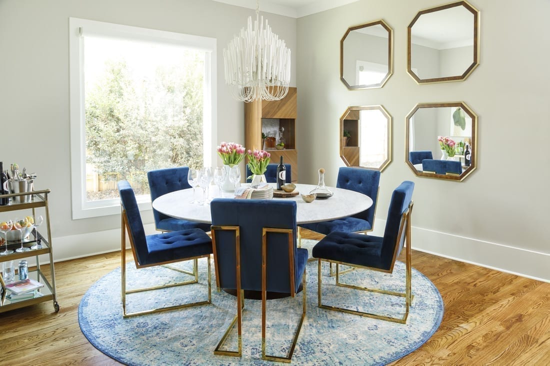
In the nearby dining room, the round marble dining table from Restoration Hardware is encircled with blue velvet and brass chairs from Burke Decor. Natalie—an admitted fan of all things brass—picked out the ensemble, which Sims surrounded with warm touches of wood through mirrors and a marble and walnut bar cabinet from CB2. Presiding over the formal dining area is a Tilda chandelier from Arteriors.
“I found myself adding a lot of brass accents—probably too many,” Natalie admits. “Gina helped balance out all the brass decor by bringing in a lot of natural wood accents as well, which I would have never thought to do on my own.”
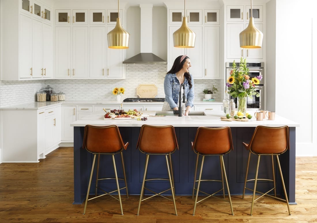
The kitchen echoes the surrounding modern aesthetic with a dark blue island, white cabinets, elongated hexagon tile backsplash and brass hardware. Leather and brass bar stools from Global Home invite guests to sit and mingle below gold pendants from Progressive Lighting. Sims suggested the addition of a matte black sink faucet to contrast against the white quartz countertops.
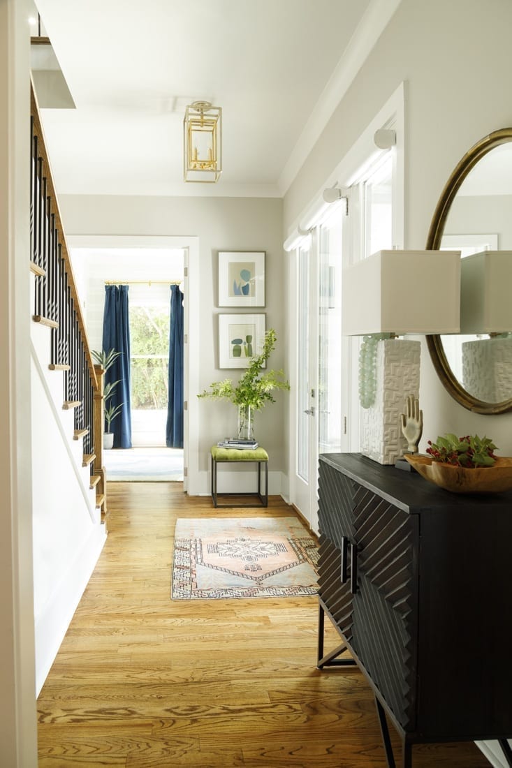
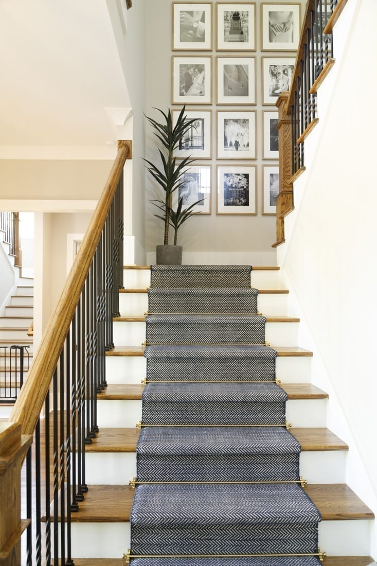
The home’s entryway was also brought to life with Sims’ decorative touch. An antique Turkish rug leads to a stairway outfitted with a custom blue and white runner accented with brass stair rods or, as Sims like to call it, “jewelry for the stairs.” On the landing, a striking black-and-white photo gallery wall shares moments from the couple’s Austin wedding on New Year’s Eve.
“It’s a great reminder of how our family began,” Natalie says.
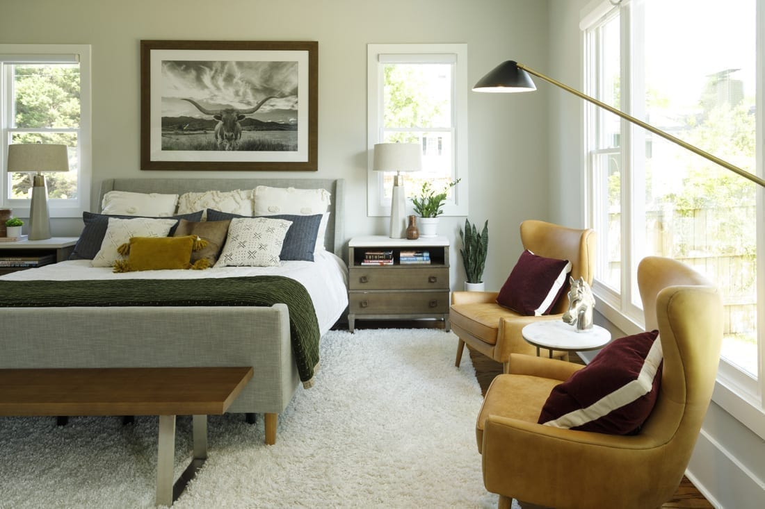
The nostalgia for the Lone Star State— where William grew up and the couple met—is felt throughout the home. It’s most prominently displayed in the master bedroom where a photo print of a Texas Longhorn presides over the West Elm upholstered sleigh bed that Sims dressed up in Ballard linens and Etsy pillows. “They wanted Texas, and this is where Texas was going to be,” Sims says. “Everything else was textures; muted, earthy colors in textiles; and wood grains to feel luxurious.”
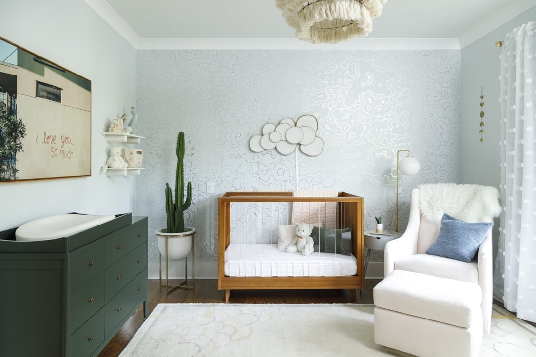
The modern yet slightly rustic vibe of the master bedroom is also felt in the upstairs nursery, which is anything but infantile. Sims worked her magic with a Lucite and wood crib from West Elm, a feminine tassel chandelier and artsy Selenite wallpaper by Faye Bell, creating an ethereal vibe. For the wall decor, she had a wood-slice cloud made and framed an image of an iconic Austin wall graffiti mural showcasing the words “I love you so much.”
“William and I have taken many photos in front of [the mural] over the years. One of my favorites was taken while I was pregnant with Bridgette, and we used it as inspiration,” Natalie says. “Gina did an amazing job recreating the mural with a custom color design to fit into our nursery.”
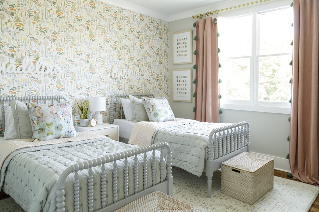
The Brookses continue to nest and recently enlisted Sims to redo Natalie’s office now that she’s working from home more and outfit a “big girl room” for Bridgette who will become a big sister to a new baby girl, Madeline, this month. They also have dreams to install a pool and outdoor living space in their walk-out backyard.
“One of Natalie’s absolute favorite things to do is to host company for dinners, parties or long stays,” Williams says. “When you come into our home, you are welcomed like family.”
For now, they are focusing on their growing family and continuing to settle into their new address. It may not be Texas, but it’s become their home.
GINA SIMS’ TOP 5 WAYS TO INCORPORATE COLOR INTO A NEUTRAL PALETTE
1. Art. “Art can be invested in from a trip or a gallery, but there are literally thousands of low-cost options out there as well. Our favorites for eDesigns are printables from Etsy.”
2. Pillows. “Textiles really elevate a space. I insist on down inserts.”
3. Rugs. “Never go for a small rug. There are great guides online if you’re not sure of the size. If you can’t afford a fabulous rug in the size you need, consider layering it on top of a rug made from a natural fiber like jute or sisal.”
4. Accessories. “Sets of boxes or vases or a lamp make great options to bring in fabulous color and are easily moved when the mood changes.”
5. Paint. “Even with a neutral palette, it does not mean your walls need to be white or gray or beige. Consider a dark moody color and use light neutral art on top of that. The contrast looks amazing.”
PHOTOS: Patrick Heagney
Giannina S. Bedford is multi-faceted writer and editor. Her work covers design, travel, food and business. She’s penned Simply Buckhead’s home feature since inception and held a variety of editorial roles at the magazine. Her freelance work has appeared in Condé Nast Traveler, USA Today, Virtuoso Life, Hemispheres and TravelandLeisure.com. She also contributes regularly Atlanta Business Chronicle. Fluent in Spanish, Giannina was born in Miami and grew up in Brazil, Chile, Hawaii and Australia. She currently lives in Dunwoody with her two kids and husband.


